Victoria Transport Wayfinding: Clarity Through User-First Design
How a seemingly simple bus stop sign perfectly embodies thoughtful design that serves people in their daily lives through clear information hierarchy and user-centered thinking.
The sign follows a clear information hierarchy: the PIT logo establishes the transport authority, route number (498) is prominently displayed, and destination information (Hoppers Crossing Station) is immediately clear. The "Hal Street" identifier matches destination information signs found across Melbourne. This design stems from Victoria's comprehensive Wayfund guidelines, which prioritise user experience through six core principles: focusing on users, reducing clutter, disclosing information progressively, creating connectivity, maintaining consistency, and using Standard Hierarchy.
The color coding follows the Department of Transport's visual system where each transport mode has its designated color (red for buses). The high-contrast elements and Network Sans typeface ensure legibility for all users, including those with visual impairments. Even the placement—at eye level and perpendicular to the street—maximises visibility from multiple angles. What makes this design truly successful is its invisibility—riders don't notice the design, they just find the information they need when they need it. It's a reminder that excellent design doesn't call attention to itself; it simply makes life easier.
The geometric pattern in the top left corner of the bus stop sign:
Is a geometric design element from the Public Transport Victoria (PTV) brand identity This angular, triangular network pattern represents connectivity and movement throughout Melbourne's transport network
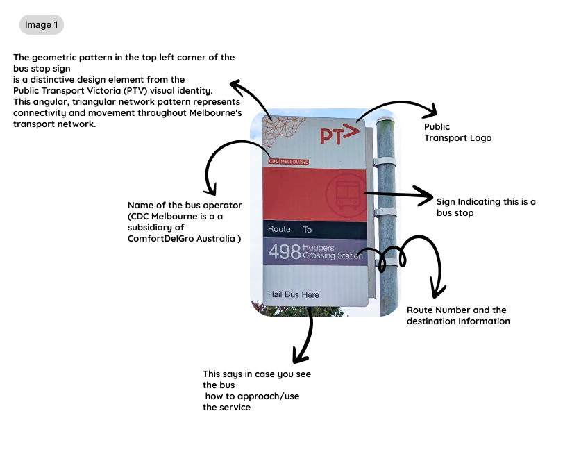
Name of the bus operator (CDC Melbourne is a subsidiary of ComfortDelGro Australia) Public Transport Logo Sign indicating this is a bus stop Blue color and the destination information
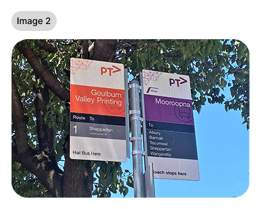
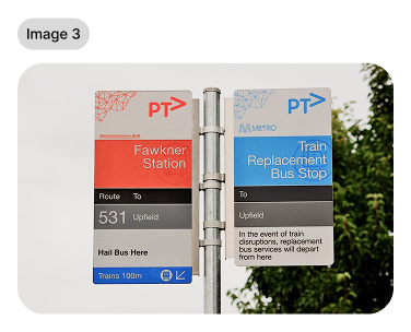
Image: 2 & 3
Looking at the additional examples in images 2 and 3, we can see how this design system extends across different services while maintaining visual cohesion. The system uses consistent information architecture across all signs, but cleverly/clearly employs colour-coding to differentiate service types:
orange/red for regular buses purple for coach services and blue for non-commercial services.
This colour differentiation serves as an immediate visual cue that helps riders quickly identify service types without needing to read every detail. Even when service needs change—like during train disruptions—the system accommodates these changes through pre-designed panels, such as the one indicating bus connections. The power of this design lies in its balance of consistency and flexibility, reducing cognitive load for travellers while ensuring the system can respond to changing transport needs. It's a masterclass in creating design systems that work across multiple touch-points while maintaining a unified user experience.
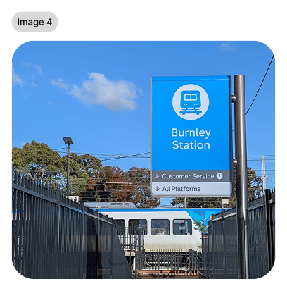
The Burnley Station sign demonstrates how Melbourne's transport design system applies unified wayfinding across all modes. The blue color coding immediately signals "train services," while the familiar information architecture remains consistent: transport type, station name, and essential wayfinding below.
Notice the same brand element from the bus stops—the geometric pattern in the top left—creating a consistent, rounded format. Whether catching a bus or train, users encounter the same design language, reducing cognitive load for multi-modal journeys.
This systematic approach transforms potential chaos into a cohesive, learnable system that works at city scale. It's design thinking applied beyond individual touchpoints to create seamless urban experiences. Great wayfinding systems work so well that users don't even realise the visual language when switching between transport modes.
Research & References
Wayfound Victoria Guidelines
Image 2 - Destination Hires
Image Source:
https://www.flickr.com/photos/danielbowen/52799573597/
ptv.vic.gov.au/footer/about-ptv/victoria-guidelines
This analysis is part of my ongoing exploration of design in everyday objects and spaces.